Blinds, in addition to their main function of protecting from the sun, can also serve as a decorative element and an accent on the windows, therefore, when choosing, they are often considered as decoration, and not as sun protection, because 1000 fabrics or slats can be suitable for sun protection, but the color and texture of these same fabrics and will set the tone for the room. To make the right choice, you should pay attention to everything, the color of the walls, furniture, the style of the room and the proportions between windows and walls. A good example is a white or gray room with the same color walls and furniture and a couple of red ottomans or a bright coffee table.
Such rooms seem laconic and quite stylish, because the entire interior is neutral and a couple of bright accents give that same style. If you remove bright objects, you will get a white, unremarkable room. This is exactly how curtains work; in a white room, bright fabrics can become the very accent that will add color and style to the entire interior.
The field of curtains and blinds is developing rapidly, and if previously calm pastel colors in the home were considered popular, now bright colors and signs are shining from all sides, so sometimes you want to extend the cheerful atmosphere at home.
Blind materials
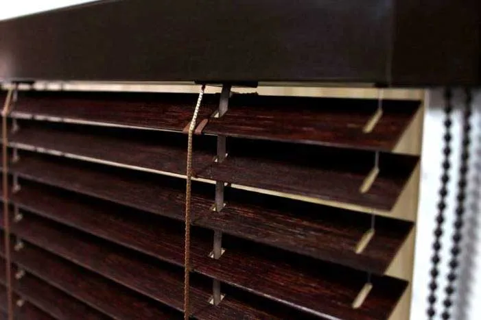
All standard blinds are made of aluminum; this is an excellent material in its properties; such blinds do not rust, do not fade in the sun, are light in weight and look great. Due to their properties, aluminum blinds, with proper care, will serve you for a long time if the slats are not damaged in other ways.
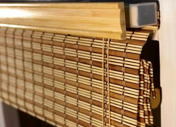
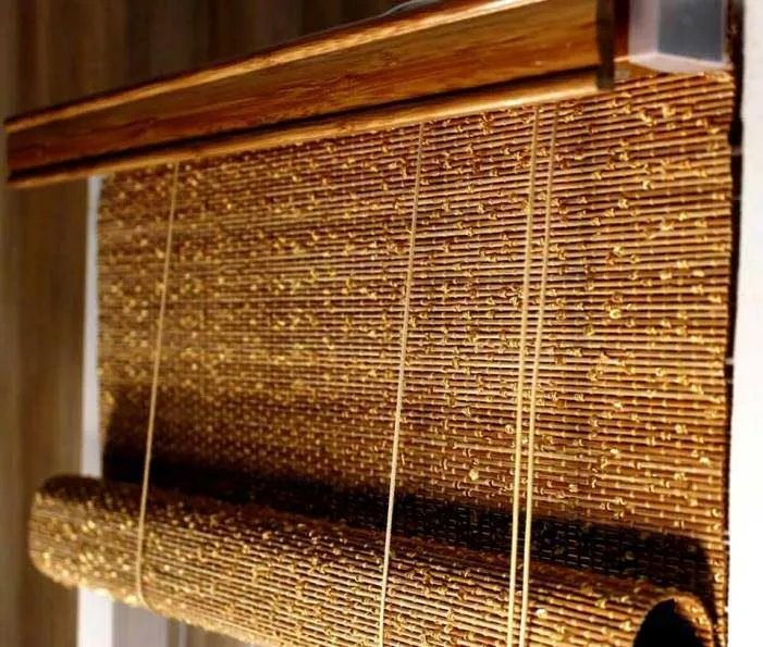
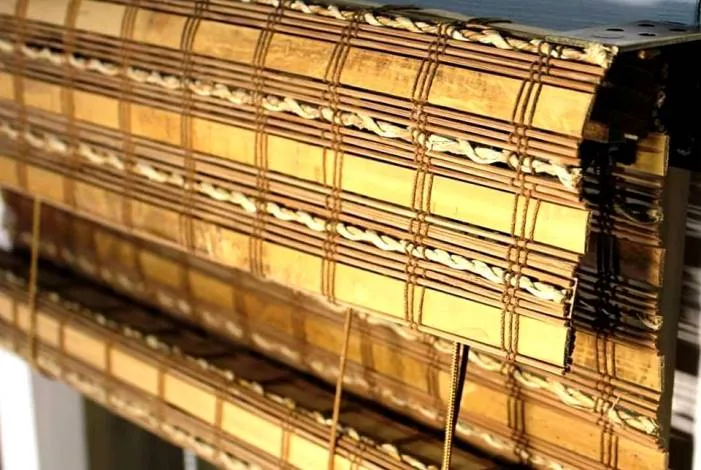
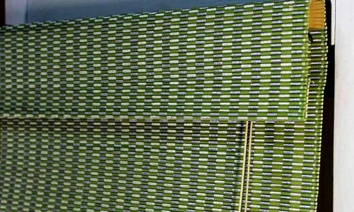
In addition to aluminum, blinds can be made of wood, bamboo or fabric in cases where the blinds are vertical.
Universal colors when choosing blinds
Classic color options are unobtrusive shades, for example, beige, white, blue and natural shades of yellowish from sand to honey, as well as wood tones, cherry and others.
The classic palette often greatly simplifies the choice because the walls and furniture are often made in one of these colors, so it’s quite easy to choose the right color for curtains if you discard all other options. But keep in mind that these are classic options, that is, the curtain will not stand out against the background of the interior, but rather complement it; to create accents, you need to use other colors.
Accent colors
Accents are not necessarily bright colors and contrasting shades; sometimes it is enough to take dark curtains into a bright room, and this will already be an accent on the windows. That is, colors are often used as accents that are very different from the rest of the interior and walls. For example, red, green, blue, yellow, as well as fabrics with patterns and ornaments. Curtains with photo printing stand out; such products can be made either neutral or very bright and expressive, it all depends on the chosen pattern and its color. Don’t forget that even when using accents, the blinds should stand out, but not in isolation from the rest of the room, that is, they should look good and focus attention on the windows, but if you overdo it, the blinds will look like an alien element that doesn’t fit at all. In this case, the interior will not be an accent, but an extra decor. For example, you decide to hang bright blinds in a room with beige walls and red upholstery, in which case blue curtains will look strange.
But if the curtains are red-beige or even burgundy, the curtains will look quite good, because they match the furniture and walls. You can also pay attention to the door handles and the chandelier; these are elements that rarely change and, like curtains, will maintain the same style of the room for a long time.
How to choose the colors of curtains and blinds
In addition to the standard obvious advice not to combine warm and cold colors, there are some nuances regarding room lighting, because curtains should not only decorate, but also protect from the sun.
If the windows of the room face the sunny side, you can choose darker and cooler shades of curtains, because the abundance of light will prevent the room from being in twilight and there will always be enough light. Between dark and cold fabrics, preference should be given to cold tones, because you need to be able to work with dark shades so as not to spoil the geometry of the room; these colors include black, dark gray and graphite shades. In turn, cool tones like blue or purple will give a slight cool effect to the room even in hot weather.
The second option is partially or completely shaded rooms, this can happen for absolutely any reason, for example, houses standing next to each other shade each other, trees outside the window block the sun with leaves, or the house is simply placed in such a way that the sun bends around it from the side and does not shine directly into the windows. In the case of such rooms, you should choose bright, warm shades to add bright colors to the room even if there is insufficient lighting. Beige, yellow and orange shades are well suited for rooms with a lack of daylight.
Dimensions of rooms and the influence of curtains on the geometry of rooms
In small rooms, it is recommended to choose mono-colored interiors without sharp boundaries, thereby reducing the number of outlines and visually the room will appear larger, but if you emphasize the corners and windows, you will immediately be able to easily determine the size of the room, thereby reducing the already small space .
If you have long window openings, you can install blinds separately on each sash, so the window will look more interesting and attractive, and a nice bonus will be the ability to control the light in the room using separate curtains.
Regarding the stripes, everything is quite simple here, as in any other finishing option, vertical stripes increase the height, and horizontal stripes increase the width. This applies not only to curtains, but also to wallpaper and furniture. Here everyone makes a choice for themselves, build according to their taste, a low ceiling is visually enlarged by vertical blinds, and narrow windows can be easily expanded with the help of horizontal slats.
If an accent wall is used in the room, then the curtains should match the rest of the interior, for example, one white wall and the other beige, in which case the curtains should also be beige and not stand out from the rest of the style of the room. Otherwise, if you add a third color to an existing two-color interior, it can easily be overloaded, thereby making the curtains seem superfluous in the finished design. Such cases occur if the owner of the room would really like orange curtains, but the designer has already used white, gray and blue colors in the room. It sounds like an obvious solution, but sometimes it needs to be emphasized because the desires may not coincide with the result. A similar situation can arise if several people are designing a design and everyone pulls the blanket over themselves.
Long and narrow openings should be closed with horizontal blinds, otherwise if there are a large number of long vertical slats, they will narrow the already narrow and high opening.
Influence of interior style
Each style implies corresponding elements, not only in color, but also in appearance. For example, Italian classics with an abundance of wood go well with wooden horizontal blinds. On the other hand, in high-tech wood can look strange because it is closer to the classics and not to the modern style.
Color options according to interior style
Gray, white and silver are universal colors for loft and minimalist styles, so even ordinary blinds in silver will look good together with modern appliances and simplicity of the interior.
Black, red, silver - will suit well in the high-tech style, with a little clarification, red should be present not only on the curtains, but also in other interior elements, otherwise gray and black will complement modern design elements that are now in fashion.
Calm vertical blinds or Roman blinds, for example, in beige or muted rich tones are well suited for modern and romantic styles.
Scandinavian, as well as eco, ethnic styles are well decorated using natural shades from bamboo and wooden materials in different versions. Also, don’t forget about bamboo roller blinds. To save money, you can use blinds with wood lamination.
Mediterranean style involves fabric curtains, for example, Roman or roller blinds in the color of the sea and sun, sand or sky.
Pop art or art deco imply the presence of two contrasting colors, for example black and white without shades, they will fit well into the interior. You can also install curtains with photo printing, for example, with a contour pattern, this will be a good addition.
A light day-night model with an unobtrusive pattern is well suited to the Provence style. Light fabric blinds with floral motifs will also look good.